Catalog
The designs
Three directions, the same complete structure: home, full menu, restaurant introduction and practical information. You replace the name, photos, menu and address with your own.
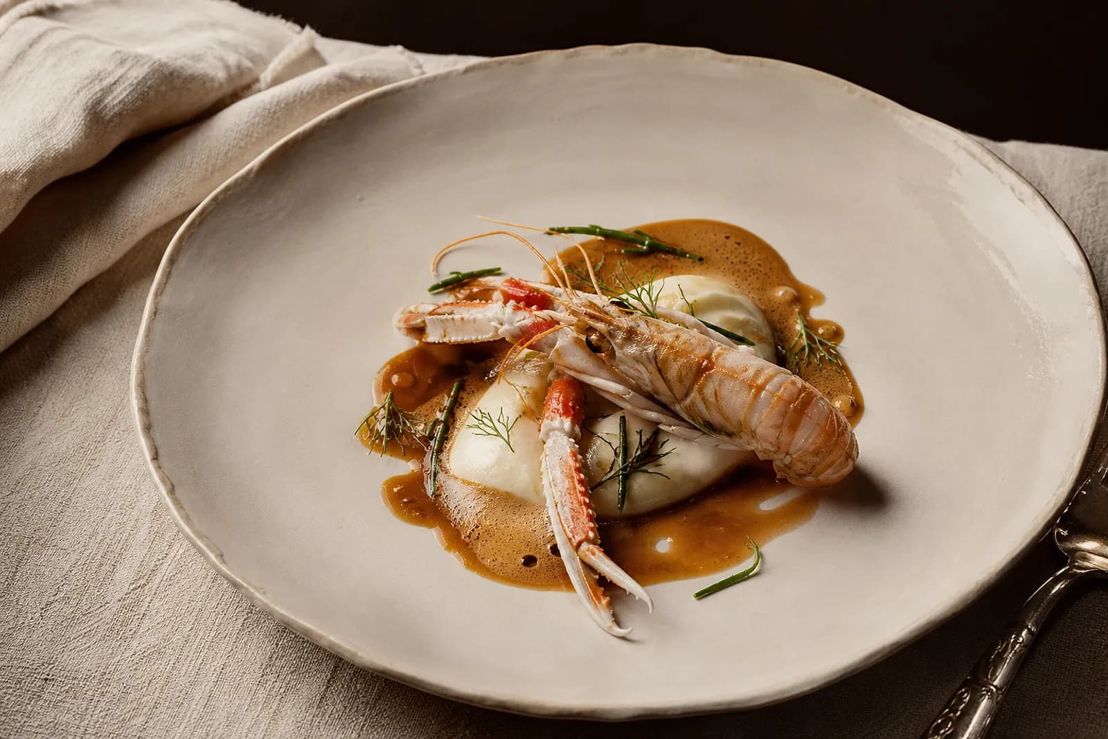
Luxe
Editorial serif, wide margins, ivory and gold on a dark ground. Built for venues that want quiet confidence.
- Home, full menu, introduction and practical info
- Large opening photograph and short gallery
- List-style menu with aligned prices, clear on phones
- Address, hours, phone and directions always at hand
Ideal if you want
Elegant · Editorial · Refined · Timeless
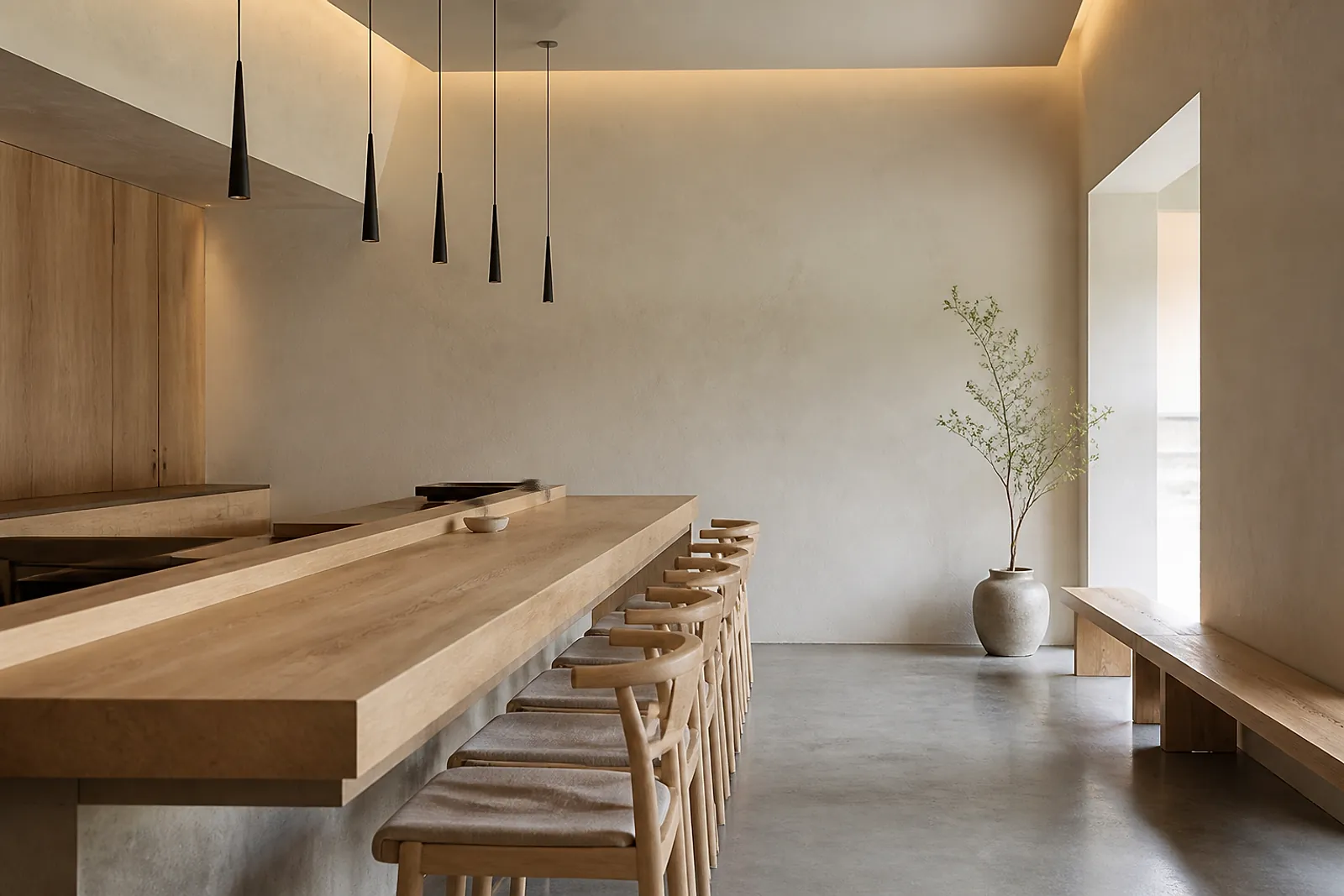
Minimal
Light ground, calm grid, natural light. The fastest of the three to read — especially on a phone.
- Home, full menu, introduction and practical info
- Light ground and calm grid, maximum contrast
- Menu organised by dish families
- Hours, address and access in a single clear block
Ideal if you want
Clear · Modern · Direct · Calm
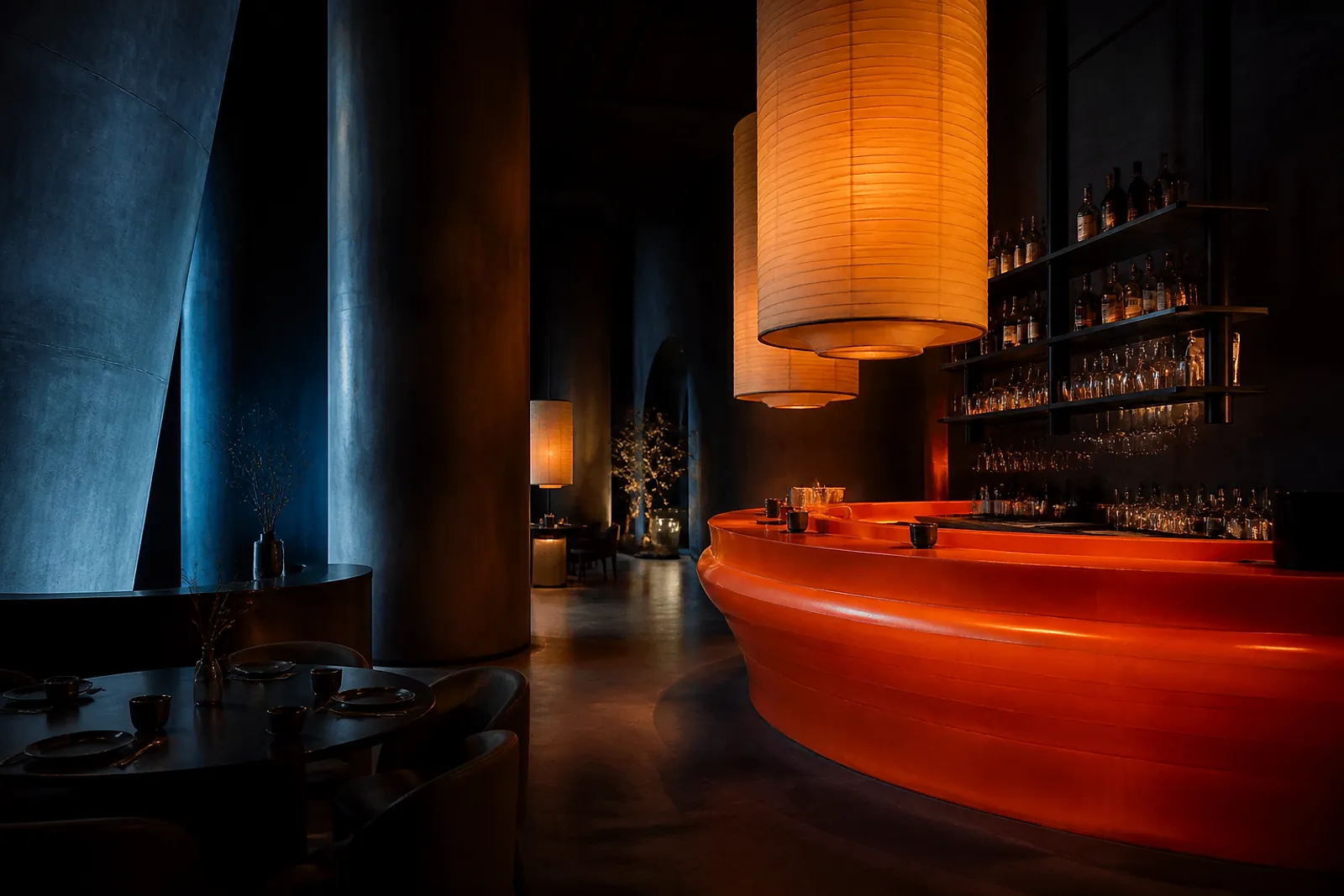
Signature
Bold type, frank colour, off-grid compositions. For venues that want a strong identity of their own.
- Home, full menu, introduction and practical info
- Large typography and a bold accent colour
- Signature dishes in a horizontal scroll
- Contact and access highlighted, immediately readable
Ideal if you want
Creative · Bold · Original · Memorable
Torn between two directions?
Tell us in two lines what you serve and who you welcome. We reply with a recommendation, no strings attached.
Or visit the Maison Aurelia showcase.